Would you like to know the most appropriate stamping technique for pencils colouring of a half solid half outline stamp impression?
I continue exploring card-making techniques suitable for pencils colouring.
Today I bring two cards to your attention made with Wonderful Florals stamps and coordinating dies set from Concord & 9th coloured with Polychromos pencils.
From this post you will see what stamping technique is the most convenient for pencils colouring and why.
The basic idea of Tone-on-Tone Stamping is to stamp images down to a coloured card stock using the same or very similar shades of ink. A design stamped on coloured card stock appears a few shades darker than the card stock giving your project depth.
The most common way to apply Tone-on-Tone Stamping technique is to match ink colour to your card stock or to use clear embossing ink, e.g. Versamark.
Fast drying dye inks leave smooth images and a lot of space for colouring. While, au contraire, heat embossing is eating up a space.
Wonderful Florals main stamp from Concord & 9th has a lot of small elements, which would be difficult to colour properly with pencils if it was heat embossed.
Wonderful Florals stamps set from Concord & 9th is a half solid half outline stamp. The flowers, foliage and letters are outlined images, and the space between the elements is a solid area. Tone-on-Tone Stamping adds a shade to the solid area and creates a fine outline for all the elements.
Besides I wanted to preserve one colour for background. The design of the main stamp is opulent enough, and I wanted to avoid adding a new colour as a background colour.
The word Wonderful is die cut with a matching die from a piece of silver glitter card stock and popped up for extra dimension.
To complete the card I made drops with Morning Dew Nuvo Crystal Drops. Beware that it dries clear.
The image is coloured with Polychromos colour pencils from Faber-Castell.
The word Wonderful die cut from Gold Sparkle card stock from My Favorite Things stands out brightly enough without a foam tape. I used Mini Multi Medium Matte glue that leaves no shiny traces on black card stock.
At the final step I embellished the assembled card with Nuvo Crystal Drops in assorted colours.
Do not limit yourself to using only the big image. The smaller elements images are good for making more CAS cards.
If you have not done yet, follow my blog so you can read the future posts as soon as I publish them and be updated about Crafty Sales events and discount codes.
For details and personal recommendations please see THIS PAIGE

I continue exploring card-making techniques suitable for pencils colouring.
Today I bring two cards to your attention made with Wonderful Florals stamps and coordinating dies set from Concord & 9th coloured with Polychromos pencils.
From this post you will see what stamping technique is the most convenient for pencils colouring and why.
Tone-on-Tone Stamping in Card Making
Tone-on-Tone Stamping is rather popular technique among card makers for creating cards backgrounds and quick mass production of cards.The basic idea of Tone-on-Tone Stamping is to stamp images down to a coloured card stock using the same or very similar shades of ink. A design stamped on coloured card stock appears a few shades darker than the card stock giving your project depth.
The most common way to apply Tone-on-Tone Stamping technique is to match ink colour to your card stock or to use clear embossing ink, e.g. Versamark.
Inspiration for My Cards
I partially drew my inspiration from designs created by Mariana Rodrigues, the Portuguese illustrator living in London, for Nespresso Spring Limited Edition Coffee called The Mythical Origins of Coffee. |
| Source |
Why Did I Stamp Tone-on-Tone?
Tone-on-Tone Stamping gives an opportunity to use coloured card stock and produces impressions with less visible outline which is better for no-line colouring with pencils.Fast drying dye inks leave smooth images and a lot of space for colouring. While, au contraire, heat embossing is eating up a space.
Wonderful Florals main stamp from Concord & 9th has a lot of small elements, which would be difficult to colour properly with pencils if it was heat embossed.
Wonderful Florals stamps set from Concord & 9th is a half solid half outline stamp. The flowers, foliage and letters are outlined images, and the space between the elements is a solid area. Tone-on-Tone Stamping adds a shade to the solid area and creates a fine outline for all the elements.
Besides I wanted to preserve one colour for background. The design of the main stamp is opulent enough, and I wanted to avoid adding a new colour as a background colour.
Green-on-Green
For my first card I picked a green cards stock and dye ink. An image is die cut and stamped with a help of MISTI tool and then coloured with Polychromos pencils from Faber-Castell.The word Wonderful is die cut with a matching die from a piece of silver glitter card stock and popped up for extra dimension.
To complete the card I made drops with Morning Dew Nuvo Crystal Drops. Beware that it dries clear.
Black-on-Black
This card is made following the same technique, but the image stamped in black ink onto a black card stock.The image is coloured with Polychromos colour pencils from Faber-Castell.
The word Wonderful die cut from Gold Sparkle card stock from My Favorite Things stands out brightly enough without a foam tape. I used Mini Multi Medium Matte glue that leaves no shiny traces on black card stock.
At the final step I embellished the assembled card with Nuvo Crystal Drops in assorted colours.
Wonderful Florals Set from Concord & 9th
Wonderful Florals stamps set contains one stamp big enough to cover a standard Portrait card front and seven smaller stamps which can be used for enhancement of the big image, e.g. a popped up flower or a striped pattern for letters. It contains also six sentiment builders compatible with the main word Wonderful.Do not limit yourself to using only the big image. The smaller elements images are good for making more CAS cards.
More Creative Ideas for Tone-on-Tone Stamping
- If you do not have dye inks matching your coloured card stock, use clear embossing ink instead.
- Play with similar colours. Try stamping in light blue down onto green card stock or in green onto a light blue card stock. This is what I am going to try next time.
Do you want more inspiration for supplies I used?
Click to the pictures to go directly to the posts.
Pencils Polychromos coloured floral cards
Pencils colouring on black card stock.
For details and personal recommendations please see THIS PAIGE

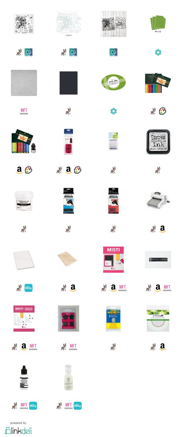
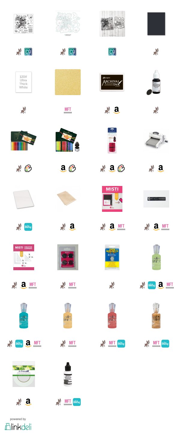
Supplies Used
Compensated affiliate links used. I personally have bought all the below displayed products. This post was not paid or sponsored.
Click on the icons below to go to your preferred online store. If you buy any of these products following my link, I will receive a small commission at no cost for you.


WOW ! This is just stunning ! Your colouring on these two coloured card stock is so eye-catching ! I am always pleasantly surprised to see what we can do with colour pencils! You managed to give so much depth in these two cards, it's just amazing ! Thanks so much for sharing and for inspiring !
ReplyDeleteDear Isabelle, thank you so much for your kind comment. I am very happy to read it and hope to see soon your pencil coloured cards ;)
DeleteКсюша, спасибо, что делишься такими крутыми находками ;)
ReplyDeleteОчень красивые открытки!!! У меня один вопрос, как ты видишь черные чернила на черном кардстоке?! В чем секрет? ;)
Спасибо, Таша, за отзыв! Техника старая, но редко применяется для открыток, раскрашенных карандашами.
DeleteЧёрное на чёрном очень просто увидеть, если найти правильный угол падения света. Поворачиваю настольную лампу, пока не нахожу нужный угол. Попробуй ;)
Ksenija, what gorgeous coloring! You continue to delight and inspire me, and I truly love how you've colored on colored card stock. Exquisite done, sweet friend! Warm hugs!
ReplyDeleteKsenija you were so right to direct me to this post, the coloured pencil colouring is fantastic on the cardstock. Gorgeous!
ReplyDeleteGorgeous cards with AH-MAZING pencil colouring! The black one is so a standout! Love them both!
ReplyDelete